This feature requires an Enterprise plan with the Events feature added.
Event-level Analytics help you gain valuable insights into your Venues events by helping you measure performance, understand your audience, and optimize content. The dashboard only shows data from July 2024 onwards. Data before July 2024 is not available on the dashboard.
For Enterprise accounts with Workspaces: Analytics are also available for both the Organization and its Workspaces. Organization Admins can view combined analytics for all Workspaces.
This article discusses how to access and interpret the analytics dashboard. Utilize event-level analytics to measure performance and understand audience engagement.
In this article:
- Access the analytics dashboard
- Change the Date and Time for analytics
- Venues Space/s for dashboard
- Reach section
- Graphs in the dashboard
- Engagement data
- Widgets data
- Audience data
- Top regions map
- Top sources
- Top devices
Access the analytics dashboard
The Analytics panel will show you the event analytics. These include:
- The total number of registrations the event has
- The total number of attendees
- The percentage of turnout (i.e., how many registrants attended the event)
- Peak attendance (i.e., the highest number of concurrent attendees the event had)
- Average time attendees spent within the venue
To access the Analytics dashboard:
- From the Venues entry page or from within the Venue, select Settings from the top navigation bar
- Select Analytics
Change the Date and Time for analytics
To change the Date and Time for analytics
- Select the Date & Time field
- You can select a specific Date & Time or select from the 3 available presets.
- Select a date from the calendar
- Select a time from the dropdown or manually enter the desired time
- Select a timezone
- You can report up to 24 hour range
- Select Apply.
Venues Space/s for dashboard
The dashboard can show analytics for all the spaces within a venue or a specific space. To select Venues Space/s for the dashboard In the space selector, you can choose the space from the drop-down.
Reach section
This helps understand the size and composition of your audience with metrics like:
- Total registrants and attendees
- Total registrants = Lifetime Registrants: This number represents the number of people who have registered at this venue since it opened.
-
Total attendees (Dashboard Range): This number shows the total number of people who attended events at this venue within the specific time frame selected on the dashboard.
- Peak attendance
- Attendance rate
Graphs in the dashboard
You can expand/collapse the graphs in the dashboard, and access granular data by hovering over the graph. The triangle icon in the graph is Peak data.
Engagement data
This helps gauge how actively your audience is participating and tracking metrics like:
- Total and average time attended
- Interactions with engagement tools (reactions, chat, raise hand)
- Engagement rate
- Interactions per attendee
Hover over the expanded graph to gain access to granular data
Widgets data
This helps you see how attendees are interacting with interactive elements by tracking metrics like:
- Q&A participation
- Poll responses
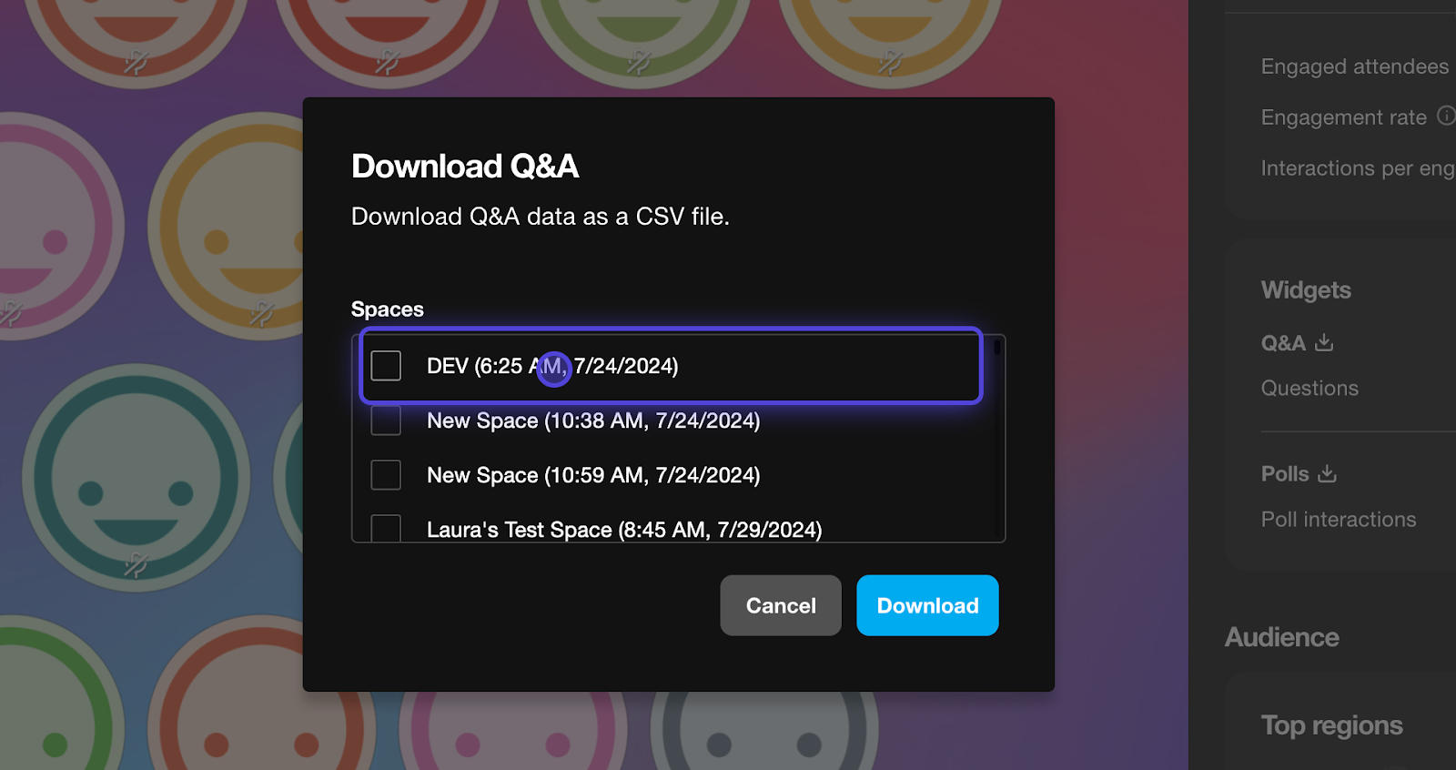
To export data the data:
- Select the Export icon to export CSV reports of Q&A or Polls Data.
- Select a specific space where you hosted the Q&A and Polling sessions.
- Select Download to download CSV export.
 Audience Data
This helps you learn about the demographics and behavior of your attendees by tracking metrics like:
- Geographic location
- Source URL
- Device types
Top regions map
This visualizes where your attendees are from around the world. You can interact with:
- The map
- Color-coded legend
- Countries listed
Top sources
See how attendees discovered your event, such as through direct links or embedded websites.
Top devices
This helps you understand what types of devices (desktop, mobile, etc.) your audience is using to access your event.